
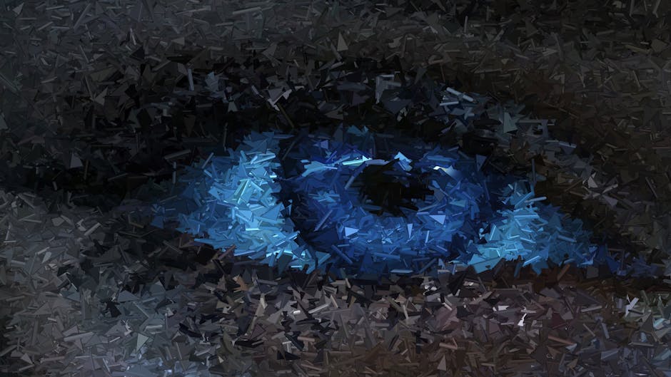
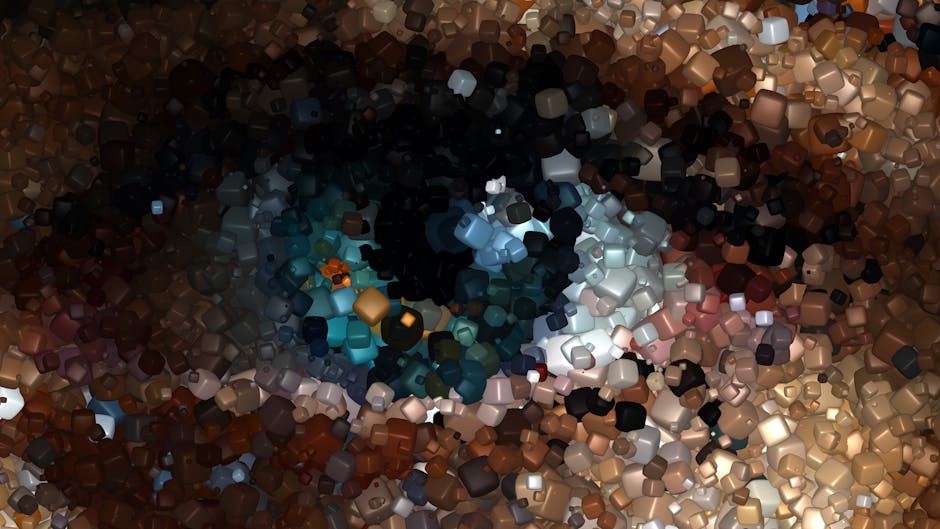
The Significance of Color in My Work
Have you ever wondered why certain colors make you feel happy, calm, or even anxious? Color has a profound effect on our emotions and perception. In my work, color isn’t just a visual choice; it’s a powerful tool that shapes experiences and tells stories. Let’s explore how color plays a vital role in my creative process.
Why Does Color Matter?
Color impacts our daily lives more than we realize. Studies show that color can influence our moods, decisions, and even our health. For instance, did you know that blue is often linked to feelings of calmness? that’s why many spas and wellness centers use blue shades in their decor.
When I create, I consider how each color can convey messages and evoke emotions. it’s not just about looking pretty; it’s about connecting with people. Think about a stop sign: it’s red because that color grabs attention and signals danger. That’s the power of color.
How Do I Choose Colors for My Work?
Choosing colors is both an art and a science for me. Here are some key factors I consider:
- Purpose: What do I want to express?
- Audience: Who will experience the work?
- Context: Where will it be displayed?
For example, if I’m designing a piece for a childrens project, Ill use bright, playful colors. These colors create a sense of joy and excitement. In contrast, a corporate design might lean towards blues and grays, which convey professionalism.
What Are the Meanings of Common Colors?

Each color has its own meaning, and understanding these can help you make better choices. Heres a simple breakdown of a few common colors:
- Red: Passion, energy, love
- Blue: Trust, tranquility, stability
- Green: Growth, nature, renewal
- Yellow: Happiness, warmth, optimism
- Purple: Creativity, luxury, wisdom
These meanings can shift depending on cultural context. For example, in some cultures, white symbolizes purity, while in others, it represents mourning. it’s essential to be mindful of these differences.
How Do Colors Interact with Each Other?

Colors don’t just exist in a vacuum; they interact with each other. This is where color theory comes into play. There are three main categories of color relationships:
- Complementary: Colors opposite each other on the color wheel (like blue and orange) create vibrant contrasts.
- Analogous: Colors next to each other (like blue, blue-green, and green) create harmony.
- Triadic: Three colors evenly spaced on the wheel (like red, yellow, and blue) offer balance and variety.
When I combine colors, I aim for a feeling or mood that aligns with my intention. For example, using complementary colors can make an image pop, which may be great for advertising. On the other hand, analogous colors can create a more soothing effect, ideal for a relaxing space.
Can Color Affect Perception?
Absolutely! The colors I choose can alter how my work is perceived. A bright, colorful painting may feel playful, while a monochromatic piece may invoke seriousness. Research shows that color can even affect our judgment. For instance, a study found that people rate food as more delicious when it’s presented in colorful packaging.
How Do I Use Color to Tell a Story?
Color storytelling is a powerful technique. Each color can represent different characters, emotions, or themes. In my work, I often use color to guide viewers through a narrative. For example:
- Warm colors: (reds, oranges, yellows) can represent passion or conflict.
- Cool colors: (blues, greens) can signify peace or resolution.
In a recent project, I used warm colors to depict the chaos of a crowded city. As the work transitioned to depict a peaceful park, the colors shifted to cool tones. This transition helped convey a sense of calm and relief.
What Are Some Common Misconceptions About Color?
There are many myths about color that can lead to confusion. Here are a few I often encounter:
- Myth: Dark colors make a space feel smaller. Fact: Dark colors can create a cozy atmosphere, while light colors can make a space feel larger.
- Myth: Bright colors are always cheerful. Fact: Bright colors can evoke different emotions depending on their context and how they are used.
Understanding these misconceptions helps me make informed decisions in my work. I encourage everyone to explore color with an open mind!
How Can You Use Color in Your Life?
You don’t need to be an artist to harness the power of color. Here are some simple ways you can use color in your everyday life:
- Home decor: Choose colors that reflect your mood or energy for different rooms.
- Clothing: Wear colors that boost your confidence or express your personality.
- Art projects: Experiment with different color palettes to find what resonates with you.
Even small changes can make a big impact! Consider painting one wall in your room a bold color. You might be surprised at how it transforms your space.
Conclusion: Embrace the Power of Color
Color is a universal language that can speak to all of us. It has the power to influence feelings, convey messages, and create connections. As I continue to explore color in my work, I invite you to do the same in your life.
Remember, there are no strict rules when it comes to color. Trust your instincts, and let your creativity flow. Whether you’re decorating your home or creating art, embrace the journey of color discovery!
For more insights on color theory, you can check out this resource on color psychology. For tips on using color in everyday life, visit my post on color in your life.