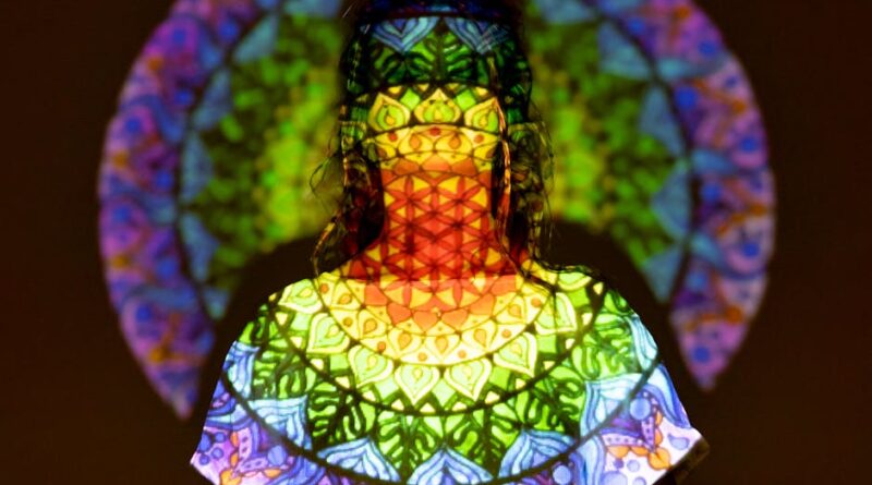
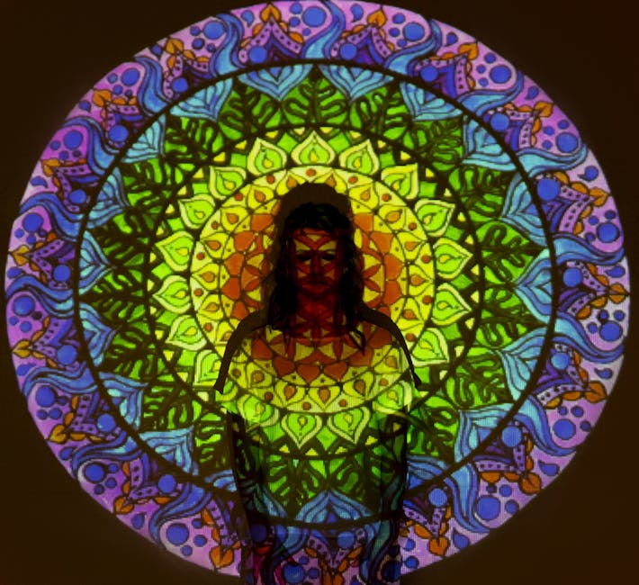
The Power of Color in Your Art
Have you ever wondered why some paintings grab your attention while others fade into the background? The answer often lies in color. Artists use color not just to make their work beautiful but to evoke feelings, tell stories, and capture attention. In this article, well explore the magic of color in art and how you can harness it in your own creations.
Why is Color Important in Art?
Color can change the mood of a piece in an instant. It can energize, calm, or even provoke. Researchers found that color affects our emotions and perceptions more than we realize. For example, a bright red can feel passionate and intense, while a soft blue can create calmness and tranquility. This is why understanding color is essential for any artist.
In your art, color becomes a tool. It helps convey your message and connects with viewers on a deeper level. So, how can you make color work for you?
How Does Color Affect Emotions?

Colors are like a language, speaking directly to our feelings. Here are some common color emotions:
- Red: Passion, love, energy
- Blue: Calm, trust, sadness
- Yellow: Happiness, warmth, optimism
- Green: Nature, growth, peace
- Purple: Creativity, luxury, mystery
Think about your favorite piece of art. What colors stand out? How do they make you feel? Sometimes, it’s not just about the color but how they interact together.
What are Color Harmonies?

Color harmony is how colors work together. it’s like a recipe; a pinch of one color and a dash of another create a beautiful dish. Here are a few types of color harmonies:
- Complementary: Colors opposite each other on the color wheel, like blue and orange. They create a vibrant contrast.
- Analogous: Colors next to each other, like blue, blue-green, and green. They blend well and create serene images.
- Triadic: Three colors evenly spaced, like red, yellow, and blue. This creates a balanced yet colorful image.
Using these techniques can elevate your art. Experiment with different combinations to find what resonates with you.
How Can You Experiment with Color?
Art is about exploration. Here are some ways to play with colors in your work:
- Use Color Swatches: Create a color palette before starting. This helps you visualize the overall feel.
- Mix Media: Try combining paint, pastels, or digital tools. Each medium can change how colors appear.
- Take a Color Walk: Go outside and observe colors in nature. Take pictures or notes for inspiration.
Remember, there are no strict rules. Be bold and let your creativity flow!
What are Warm and Cool Colors?
Colors are often divided into two categories: warm and cool. Understanding these can help you create depth and contrast.
- Warm Colors: Reds, oranges, and yellows. They tend to be lively and energetic.
- Cool Colors: Blues, greens, and purples. They are calming and soothing.
Mixing warm and cool colors can add dimension to your artwork. For example, placing warm colors against cool ones can bring certain elements forward, creating a focal point.
Can Color Influence Decision-Making?
Surprisingly, color can even affect our choices. Studies show that color influences how we perceive brands and products. For instance, red can make people feel urgency, while blue can instill trust. This concept applies to art as well.
When you choose colors for your art, think about what you want your audience to feel. Are you aiming for excitement, calm, or curiosity? Your color choices can guide their response.
What are Color Wheel Basics?
The color wheel is a fundamental tool for artists. It represents colors and their relationships. Here are the basics:
- Primary Colors: Red, blue, yellow. These colors cannot be mixed.
- Secondary Colors: Green, orange, purple. These are made by mixing primary colors.
- Tertiary Colors: Made by combining a primary with a secondary color, like red-orange or blue-green.
Understanding the color wheel can help you choose harmonizing colors and create more impactful art.
What are Common Color Misconceptions?
Many people believe that using more colors makes an artwork better. However, too many colors can create chaos rather than harmony. Here are some common misconceptions:
- More is Better: Sometimes, a limited palette can be more powerful.
- Black and White are Not Colors: They are essential to creating depth and contrast.
- Color is Subjective: While personal preferences matter, color psychology is a real phenomenon.
it’s essential to understand these points. They can help you make informed decisions in your art.
How Can You Use Color in Your Marketing?
If you’re an artist looking to sell your work, color plays a role in marketing too. Consider how you present your art. The colors in your branding can attract different audiences.
For example, a vibrant, colorful portfolio might appeal to a younger crowd, while muted, soft tones may attract a more traditional audience. Think about your target market when choosing colors for your art and promotional materials.
What are Actionable Takeaways for Color in Art?
Color is a powerful tool in art. Here are some actionable tips to apply what you’ve learned:
- Experiment with different color palettes to find your style.
- Study color theory and the color wheel to understand relationships.
- Use color swatches to plan your artwork before starting.
- Consider the emotional impact of your colors and how they relate to your message.
- Don’t be afraid to mix warm and cool colors for depth.
As you explore color in your art, remember that it’s about expression and connection. Your unique perspective is what makes your work special.
Where Can You Learn More?
If you want to dive deeper into the world of color in art, consider checking out resources like Artists Network. They offer valuable insights that can enhance your understanding.
So, grab your paints and start experimenting! The world of color is waiting for you. Whether you’re a seasoned artist or just starting, embracing color can transform your art and the emotions it evokes.